Rockstar revealed the GTA 6 box art ahead of the game’s Nov. 19 release date, and while the reveal mainly served as a way to announce pre-orders start soon, I can’t help but fixate on the box art. Or, more to the point, how oddly muted and lacking in personality it is.
GTA 6‘s art continues the decades-long tradition of mashing a handful of scenes and teases into a collage, mixing a few important characters with some generic GTA staples. You’ve got:
- A helicopter
- Lucia and Jason
- Some dude on a bike
- A woman in a bikini bottom and T-shirt, who’s definitely not Lucia unless Lucia gets a piercing under her lower lip at some point in the story, Maybe one of the Real Dimez, but with longer hair?
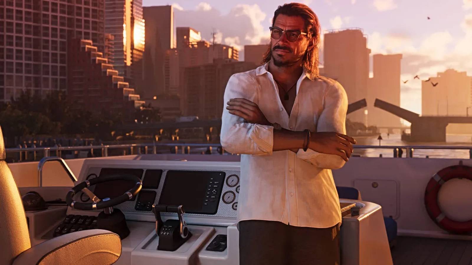
- Boobie Ike, a local not-so-legitimate business owner
- An alligator
- A car
- A motorboat with a flamingo flying over
- Raul Batista, a professional robber
All of which is presented in a fairly sauceless way, with images bearing less personality than anything in the cast list on the game’s official site. The car, bike, and helicopter are long-standing staples of GTA box art. Rockstar always devotes at least three squares to vehicles of some kind, just in case you forget it’s a series about car theft, I guess. The lack of stylistic detail is what irks me, though.
Putting the chopper in the upper left and the bike in the upper right is the same thing Rockstar did for GTA 4 and GTA 5‘s cover art. I get it’s a tradition, but there’s so much less personality in GTA 6‘s, both in the art style and the actual vehicles. GTA 4‘s gritty muted tones give you a strong idea of that game’s spirit. GTA 6‘s helicopter has pontoons. Even the gator is a bit meh. Friend, it’s Florida. Of course, there’s a gator. If you really wanted to make a GTA-style statement, you’d have a python wrapped around it as a nod to how the pursuit of excess in the state has slowly been destroying the ecosystem over 20 years.
Look at the motorboat as a contrast. The style of the boat and the flamingo flying over are small touches, sure, but it roots the scene firmly in Vice City’s Miami-but-not setting. The only other distinguishing feature in GTA 6‘s art is Raul wearing a dress shirt (or a linen shirt, maybe) and hoisting an automatic rifle up to his chest — a very GTA contrast.
It doesn’t help that Rockstar opted for a standard 3×3 grid with GTA 6’s image placement. Older box art uses the same number of images, but presented less like the opening sequence of The Brady Bunch.
But the other games had the benefit of not bearing the weight of more than half a decade of overblown excitement. We’ve seen this tone and even this art style for two years now. Seeing it one more time is hardly a big deal and certainly not an exciting one. If Rockstar revealed this art 14 years ago, it would probably just be like another round of GTA box art, rather than a muted, slightly disappointing set of rizzless images glued together.
We’re 5 months away from the biggest game of all time — and it could flop
What happens if GTA 6 flops?